Pages

Labels

Showing posts with label ugliness. Show all posts

Tuesday, May 22, 2012

Mick Jagger in the role of a loser watching other guys do karaoke versions of Mick Jagger.


The SNL guys doing the imitations are very funny, and I just loved Mick submitting to the role, particularly accepting closeups on his fascinatingly ugly face (without the familiar hairstyle/wig that keeps us seeing him as the rock star and not a regular human being).

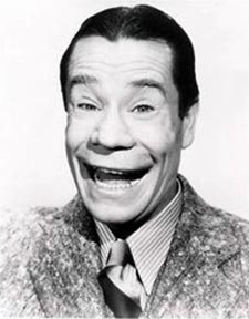
Oddly, to me, in this clip, he look like Joe E. Brown, a comic actor with a very distinctive mouth characterized by — of all things not associated with Mick Jagger — liplessness:

Monday, August 29, 2011

"'Ugliness' is not a personal trait that many people choose to embrace..."

"... those whom we classify as protected might not be willing to admit that they are ugly. But with the chance of obtaining extra pay and promotions amounting to $230,000 in lost lifetime earnings, there’s a large enough incentive to do so."

For enough money, you'll call yourself ugly.

Now, I see a problem in this line of thinking: It's easier for men to say I'm ugly than for women. The men are going to rake in all the money. Look at me! I'm so ugly! Imagine presenting that to a jury! Or do you think women have an advantage because they can appear in court without makeup and hairstyling?

Saturday, August 21, 2010

Was Art Nouveau "the clumsy process of trying to 'dress up' the inorganic forms of modern construction in the false clothing of the natural world"?

That's what Walter Benjamin thought.
If Benjamin was right about Art Nouveau in general, then Jean Carriès was a dissenter from the movement who refused to play along with the lie. Carriès did not carry the prettifying gene. He had an eye for the monstrous, for the contortions of nature and its abnormalities. If Carriès accepted the idea that the modern city is an extension of the natural world, he did so with the proviso that the extension was a malignant tumor.
The dissent from the lie looked like this:

Thursday, August 19, 2010

"In an act of shockingly retro, sexist stupidity, a local unit of the Republican Party of Minnesota..."

"... has broadcast a new reason you should vote Republican: GOP women are hot, and Democratic women are not."

My comments, in list form:

1. That's not just some guy's viral video, that's an official Republican group? Uh, speaking of "Who Let the Dogs Out," put a leash on those guys. They're not helping.

2. Did they pay royalties to appropriate "She's a Lady" and "Who Let the Dogs Out"?

3. There's a certain silliness to picking (what you think are) the prettiest pictures of one party's women and (what you think are) the ugliest pictures of the other party's women, which might be enjoyable if it was just some YouTube foolery.

4. I liked the natural look of some of the Democratic women who were supposed to be unattractive. Most of the ugliness had to do with making faces. Good for them if they can make faces. It means they aren't botoxed into expressionlessness. Too much of the supposed prettiness of the Republican women came in the form of glitzy TV makeup and hair. I got really tired of looking at them. Too much sameness.

5. The old cliché GOP argument that your women are better than your opponents' women is offputting and sad.

6.  Whoever made this video is ugly.

Sunday, August 8, 2010

I was fascinated by the bloated mugs of ugly blowhards.

P1010655

(Enlarge.)

I can't remember who that character was, but I drew that, from the TV, in the mid-90s.

Sunday, March 21, 2010

Eco-tourism, the guilt-trip.

Enough whale-watching for you. Time for urban cruise where the sightseeing is the pollution and blight of L.A. harbor.
On a drizzly afternoon, a group of tourists huddle aboard the Christopher sipping wine, nibbling cookies and gazing out at the ocean just off Long Beach. Cameras dangle from their necks, ready to record the sights....

Corroded metal shipping containers, belching smokestacks, trash-strewn waterways and oil islands highlight this harbor cruise.

The 2 1/2 -hour excursion takes passengers through a seascape short on the picturesque but full of concrete and metal -- a ride through exhaust-tinged air and past power plants, rusty warehouses and the Terminal Island prison that once housed Charles Manson and Al Capone.
What's with the wine and cookies? Shouldn't it be something more medicinal and off-flavored? Wheatgrass juice and vegan sushi, maybe.

(I must admit, I would enjoy this cruise. 1. Great photo-ops. 2. Reality is always beautiful/interesting from a safe distance.)

Monday, November 30, 2009

"In some of the pictures Lincoln's right eye looks half-asleep while the left stares wide-open."

"Cover half the face and each side looks like it belongs to a different person, one appearing downcast and uncertain, the other determined. A person speaking with him would in a sense face two Lincolns, one soft and exhausted, the other fiercely alert."

The radically asymmetrical face of Abraham Lincoln. What does it mean? Does it have something to do with the functioning — presumably high functioning — of the hemispheres of his brain? Generally, we find symmetrical faces beautiful, and this asymmetry may be the key reason we see Lincoln as ugly — though we excuse and even love his ugliness because we feel confident we are looking into the face of a great man. But let's think about asymmetry in faces of other human beings. Perhaps we should make a conscious effort to keep looking at the individuals who initially repel us. Is it Lincolnesque asymmetry? And what complexity and power of the mind lies behind that facial dualism?

And let's think about why — if my hypothesis is true — we feel drawn to the people who lack this complexity and power. It might be that we have evolved to feel comfortable interacting with simple, straightforward people, and our eyes and minds are trained by the long experience of the species to see those qualities in a symmetrical face. That is, our ancestors trusted people who were, in fact, trustworthy, and that is why they survived and produced descendants. The nonancestors of human history did not read faces so well and were betrayed by deceitful, duplicitous, wily people with powerful, complex brains.

Our ancestors were successful in their mistrust of 2-faced individuals. But that doesn't mean that today we should shun the ugly. Not all asymmetrics are dangerous. Some, perhaps, are the very greatest human beings — like Lincoln. Now that we are able to think consciously about what lies beneath the repellent face and now that we live an an ordered society, let's not pass up the opportunity to benefit from the minds that show an asymmetrical face to the world. Don't turn away from the ugly.

Thursday, May 14, 2009

"Preservationists say the building... is a classic example of Brutalist architecture that should be maintained for future generations."

It's the Third Church of Christ, Scientist, in Washington, D.C., a couple blocks from the White House.


(Photo by kimberlyfaye.)

Should we preserve historically significant ugliness? Because we need negative examples, to know what to avoid? For contrast? Because history matters? Even the 1970s?

But the church won in the end:
"Historic preservation was never meant to be more important than the very people or purposes that buildings were meant to serve... This 1970s Brutalist-designed building ... would have bankrupted this congregation and forced it out of downtown where it had been for 100 years. That makes no sense."
Sense! Should we make sense? How much more of history, art, and architecture would be lost to us now if we'd been making sense all these millennia?

Are you more convinced by the "make sense" argument — this place is bankrupting them — or by the passionate desire to demolish what is indisputably ugly?

Do you not worry that perhaps it is not ugly, not permanently ugly, and you are blinded by the aesthetics of our time? I remember, after graduating from art school in 1973, feeling quite sure the ornamentation on buildings like this was a hideous mistake and our cities needed to be stripped clean of it. Thank God I was powerless.

Thursday, November 20, 2008

"I still think that the Drudge Report is an aesthetic masterpiece even though I also consider it ugly."

Jason Fried uses the Drudge Report as a case study in how good design can also be ugly:
The Drudge Report... has proven timeless. It’s generic list of links, black and white monospaced font, and ALL CAPS headlines have survived every trend, every fad, every movement, every era, every design do or don’t. It doesn’t look old and it doesn’t look new — it looks Drudge. It hasn’t changed since at least 1997, and I believe the design goes back even further. How many sites can survive — and thrive — unchanged for a decade? That’s special.

There are no tricks, no sections, no deep linking, no special technology required. It’s all right there on one page. “But it’s a mess!” you could say. I’d say “it’s straightforward mess.” I wouldn’t underestimate the merit in that.

When you’re on the Drudge Report you’re on the Drudge Report. There’s no question where you are. The design has become iconic....

The site feels like a chaotic newsroom with the cutting room floor exposed....

One guy can run it. The site is run by Matt Drudge full time with help from an occasional part-time contributor....
I agree. There's something about Drudge that makes us want to look at it all the time. The sense that this is what the news looks like right now feels so right, even if you know it's wrong. Even that wrongness is part of the addictive power. Everything works exactly as it should.

And for all the starkness of the site, it still comes through that Matt Drudge is a specific person, with tastes and quirks. And that specificity plays out with a peculiar mix of stories, so that the big stuff is there, buffered by weird things, and the pictures and headlines are grouped to amuse us in all sorts of ways. Go there and look for some sly juxtaposition. You'll always find something.

I'll do it right now. Okay:


We've got that big phallic symbol of a missile pointing to the left, and our eyes go over and down to that vagina symbol with John Kerry poking out of it. In this symbolism, Kerry is either a newborn or a prick, but in any case, he's going to chair the Senate Foreign Relations Committee, we're told, and that's nicely thematically connected to the top story of Iran getting the atomic bomb. We see Ayatollah Ali Khamenei in his serious turban and John Kerry in his silly paper hat. This means something. This is important. Or maybe it means nothing. It doesn't matter. It's part of what bonds us to the Drudge Report.