Inside Higher Education says:
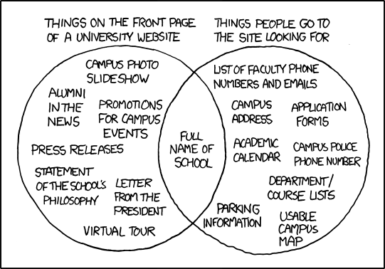
The xkcd cartoon was particularly apt in skewering three useless but nevertheless common features on a college’s home page, said Mark Greenfield, director of Web services at the State University of New York at Buffalo and an associate consultant at the major higher-ed consulting firm Noel-Levitz. Specifically: the statement of philosophy, the letter from the president or provost, and the campus news feed.
Having those up there might seem like a good idea to the administrative committees that tend to dictate website content, Greenfield said, but they are rarely useful to the website’s most strategically important kind of visitor: the prospective student. Prospective students are more interested in information about majors or financial aid than administrative rhetoric or photos or “pretty girls studying under trees” — a trope so recurrent that it became a running joke at last year’s HighEdWeb Association conference, Greenfield said. “[Prospective students] have been marketed to their entire lives, and they are not looking for that marketing hype,” he said. “They’re looking for authenticity.”

 :.
:.

0 comments:
Post a Comment